
Volume 42 Number 3
Descriptive presentation of wound care data
John Stephenson
Keywords descriptive statistics, categorical, numerical, repeated measurements
For referencing Stephenson J. Descriptive presentation of wound care data. WCET® Journal 2022;42(3):30-33
DOI
https://doi.org/10.33235/wcet.42.3.30-33
Submitted 1 August 2022
Accepted 1 September 2022
Introduction
Most published quantitative research in the field of wound care will include elements of both descriptive and inferential statistics. Descriptive statistics, which normally precede the presentation of inferential tests, describe a study sample, using summary statistics, tables and graphs. No inference is involved. Inferential statistics, which includes significance testing and confidence intervals, is concerned with the inferences made from sample data to a wider parent population, and is not the subject of this editorial.
The aim of descriptive statistical analysis is to condense data in a meaningful way and extract useful information from it. Data may take various different forms, of which the distinction between two forms, categorical and numerical, is important for decision-making concerning the most appropriate method needed to provide an effective descriptive summary of the data. Categorical variables are sometimes further sub-divided into nominal variables (i.e. those where there is no underlying ordering to the categories) and ordinal variables (with some underlying order). The categories themselves are often termed levels.
In most wound care studies, the most common sources of data are probably the wound itself and the patient with the wound. An example of patient-level categorical data is patient sex (levels: male and female); an example of wound-level categorical data is tissue type (levels: slough, necrotic etc.) An example of patient-level numerical data is patient age in years; an example of wound-level numerical data is wound length. We may also collect and report data at the aggregate level; for example, the proportion of patients with a healed wound by 30 days, or the mean number of patients treated per month by a clinical team.
Sometimes the distinction between categorical and numerical data is not clear. Responses from questionnaire items, such as the commonly-encountered 5-point Likert questionnaire item, are, strictly speaking, ordinal, but are often treated as numerical, particularly when dealing with a score which is a sum of multiple items. Other types of data can be formulated as either categorical (e.g. the proportion of wounds healed within 30 days) or numerical (e.g. the number of days to healing), depending on the context and the aims of the study.
Presenting descriptive data in text and tables
Many wound care studies generate far too much data to present it all in text. Often only key results are presented in text, with the bulk of the data appearing in tabulated form, possibly in an appendix. Whether in text or in tabulated form, standard presentation for a numerical variable is a measure of average, followed by a measure of dispersion (i.e. spread) in brackets. The measure of average quoted is almost always the mean (i.e. arithmetic mean) or the median. Medians, which are not distorted by outlying values, are usually preferred when data is likely to be skewed – such as time to wound healing or some other event, or when we are dealing with ordinal quantities (such as the sum of Likert-style questionnaire items) which are assumed to be equivalent to numerical data – otherwise, the mean, which uses all the data values, is generally preferred.
The measure of dispersion quoted is usually either the standard deviation (commonly abbreviated to SD) or the range and/or inter-quartile range (commonly abbreviated to IQR). The range of a data set is easy to calculate (simply the difference between the two extreme values) but is based only on those two measures, disregarding all others. It is distorted by outliers. The IQR, which is calculated as the range from the 25th to the 75th percentile of the data, is more robust to distortion, but still does not take into account much of the data set.
By contrast, the SD uses every observation, but can be sensitive to outliers and is generally inappropriate for skewed data. It also has the advantage that it is always in the same units of measurement as the raw data, which can help with interpretation; in normally distributed data, approximately two thirds of all observations will lie within one standard deviation of the mean. So, for example, if we are told that the mean wound diameter in a large study of venous leg ulcers is 20mm, with an SD of 4mm, then if the data is normally distributed, we can infer that about two-thirds of wounds have a diameter between 16mm (1 SD below the mean) and 24mm (1 SD above the mean). The remaining one-third of wounds would be expected to be relative outliers, either below 16mm or above 24mm in diameter.
Common pairings for presenting descriptive data are mean and SD, median and range, and median and IQR. Other measures of average and spread, such as the geometric mean, mode and mid-range, are much less commonly encountered.
Standard presentation for a categorical variable is frequency, plus percentage and/or proportion. Generally valid percentages are quoted, disregarding invalid or missing data. For example, an audit of pressure injuries in a particular hospital ward ICU might record a number of Stage 1, 2 and 3 pressure injuries in ICU patients, but some patients on the ward are missed out from the audit. It would probably be more appropriate to quote the numbers of patients with a Stage 1 pressure injury as a proportion (and/or percentage) of the patients who were actually audited, not as a proportion of all patients.
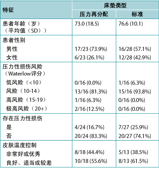
Table 1, adapted from Ousey et al.1, shows an example of tabulated data in a quite typical format. It includes both a numerical variable (age), summarised using mean and SD in each study group, and several categorical variables, summarised using frequency and valid percentage. Here the proportion is also given. The levels of each categorical variable considered are indented below the name of the variable itself. This amount of data would be difficult to absorb in text, and the side-by-side format of the table facilitates an easy comparison of group characteristics that would not be so apparent in data presented in text.
Table 1. Example of tabulated data [adapted1]
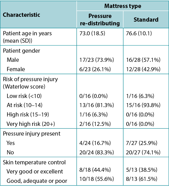
Note that the denominator is different for the different patient characteristics featured in the table; not all characteristics will have been reported on all patients. The levels of the Skin temperature control variable have been ‘condensed’ from five individual categories into two contrasting levels; this is a common device when data is spread too thinly across multiple levels for meaningful analysis, or when highlighting a contrast between two meaningful clinical states. The Waterlow variable has been transformed from its original numerical scale into an ordinal categorical variable; at the cost of a certain loss of information, this also allows comparison across levels of risk in common clinical use.
Presenting descriptive data in graphical form
Many different types of graphs are available, and most can be produced easily using modern software. Not all graphs are suitable for all types of data, however. Pie charts and bar charts are both designed to visually illustrate the relative frequencies of multiple levels of categorical variables. Despite its ubiquity, the pie chart does not seem to offer anything that a bar does not; most people find it harder to assess the relative size of sectors of a circle than they do of the heights of columns. Neither representation works well to display very large numbers of categories (which are hard to compare visually).
The bar chart can also be used to represent a quantity expressed as a proportion – Ousey et al.2 presented the proportion of patients with pressure ulceration pre- and post-implementation of a pressure reduction implementation programme in terms of a simple bar chart (Figure 1). The ‘whiskers’ around the bars represent confidence intervals, a measure of uncertainty in the quantity being measured.
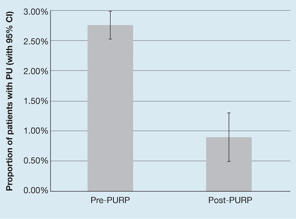
Figure 1. Example of a simple bar chart [adapted2]
A useful extension to the bar chart is the clustered bar chart which allows display of two factors concurrently. Figure 2 is a neat representation of the interplay between two categorical factors – pressure grading system status (with levels represented by the left- and right-hand clusters) and policy of referral (bars within a cluster).
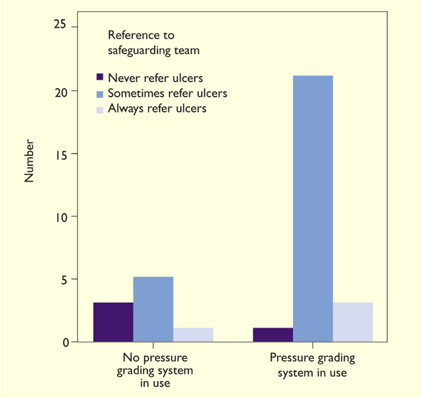
Figure 2. Example of a clustered bar chart [adapted3]
Different representations are required for numerical data. For example, a histogram, which is often confused with a bar chart, was used by Barakat-Johnson et al.4 to represent the time of response to communication with a wound specialist reported by patients using a digital app (Figure 3). It can be distinguished from a bar chart by the lack of gaps between the bars, reflecting the representation of a continuous measure rather than distinct categories. This sort of data can also be represented using a box plot, although box plots do not provide information about the full distribution of a data set.
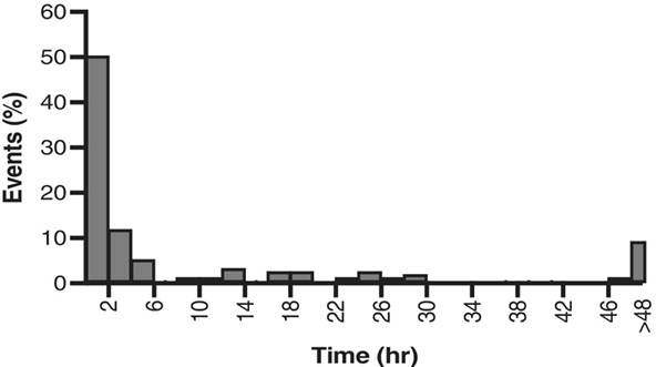
Figure 3. Example of a histogram [adapted4]
Mixed representation
The relationship between a numerical variable (such as peak pressure index) and categorical variables (such as BMI category and body position) can be neatly combined in a single representation using a line graph, as reported by Coyer et al.5. Figure 4 shows body position distinguished by the colour and shading of the line, and BMI category by the position on the x-axis.
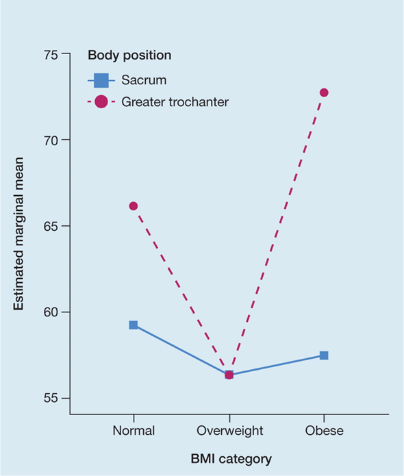
Figure 4. Example of a line graph [adapted5]
The key take-home message from this graph is that the factors interact – the effect on peak pressure of BMI category depends on where it is measured. This effect would not be immediately apparent had the same data been presented in tabulated form.
Repeated measures
Many wound care studies lend themselves to repeated measurements, for example, to examine the healing trajectory of a wound by monitoring its length at weekly intervals until healing, or investigating trends by audits of institutional aggregated data. Stephenson et al.6 presented longitudinal data (here, the number of observations of category 2 pressure injuries reported in a health organisation at monthly intervals over a period of several years) as a line graph (Figure 5), with the dotted line illustrating the underlying smoothed time-dependent trend. Here the graph is illustrating seasonal trends, an overall year-on-year downward trend, and the relationship between one data point and the preceding point (auto correlation) – effects that would be almost impossible to discern from tabulated data alone.
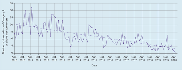
Figure 5. Example of a line graph showing longitudinal data [adapted6]
Tables or graphs?
It is not always easy to decide whether a table, graph or both is needed to summarise data. Graphs show trends and patterns in data, and the relationship between one variable and another, that would not necessarily be apparent in the same data presented in tabulated form. Tables give values to a level of precision that is generally unavailable in most graphical presentations.
Conclusions
Effective presentation of descriptive wound care data can allow a reader to quickly absorb trends and patterns in data, to compare group characteristics, and to assess the magnitude of effects. The questions that arise from wound care studies – in which we may be looking to compare the benefit of one treatment against another, maybe examine the change in wound parameters over time, or simply summarise the extent of wounds in an audit study – can often be answered simply and effectively using descriptive analysis, although, usually, such an analysis would be followed up with an inferential assessment. However, the ease with which modern software can generate graphs of any kind can sometimes be a barrier to effective communication. Many published examples exist of graphs that add little or nothing to understanding and need to be used with care.
While descriptive statistics do not facilitate drawing conclusions beyond available data or reject any study hypotheses, they can be a valuable way of adding insight to a study and require little or no specialist statistical knowledge to understand.
伤口护理数据的描述性呈现
John Stephenson
DOI: https://doi.org/10.33235/wcet.42.3.30-33
引言
大多数已发表的伤口护理领域的定量研究包括描述性和推论性统计要素。描述性统计(通常优先于推论检验)使用汇总统计量、表格和图形描述研究样本,不涉及推论。推论统计,包括显著性检验和置信区间,涉及从样本数据推论到全及总体,不是本篇社论的主题。
描述性统计分析的目的是以有意义的方式压缩数据,并从中提取有用的信息。数据可能采用各种不同的形式,其中分类和数值这两种形式之间的区别对于决策非常重要,因为需要用最合适的方法来提供有效的数据描述性总结。分类变量有时会进一步细分为名义变量(即没有对类别进行基本排序的变量)和有序变量
(有一些基本排序)。类别本身通常被称为级别。
在大多数伤口护理研究中,最常见的数据来源可能是伤口本身和伤口患者。患者级别分类数据的一个示例为患者性别(级别:男性和女性);伤口级别分类数据的示例为组织类型
(级别:腐肉、坏死等);患者级别数值数据的示例为患者年龄(以岁为单位);伤口级别数值数据的示例为伤口长度。我们还可以收集和报告总体级别的数据;例如,30天时伤口愈合的患者比例,或临床团队每月治疗的患者平均数量。
有时分类数据和数值数据之间的区别并不明确。来自问卷项目的回答,例如常见的5点式李克特问卷项目,严格地说是有序的,但通常作为数字进行处理,特别是在处理多个项目总和的评分时。根据研究背景和目的,其他类型的数据可以表示成分类(例如,30天内愈合的伤口比例)或数值(例如,愈合所用天数)。
在文本和表格中提供描述性数据
许多伤口护理研究生成的数据太多,无法在文本中全部呈现。通常仅在文本中呈现关键结果,大部分数据可能在附录中以表格形式出现。无论是文本形式还是表格形式,数值变量的标准呈现是平均值的度量,随后是括号中离散度(即分布)的度量。引用的平均值的度量几乎总是平均值(即算术平均值)或中位数。当数据可能发生偏斜时(例如,至伤口愈合所用时间或某些其他事件),或者当我们处理的是假定等同于数值数据的有序数量(例如,李克特式问卷项目的总和)时,通常首选不会被离群值扭曲的中位数,否则,通常首选使用所有数据值的平均值。
引用的离散度的度量通常为标准差(通常缩写为SD)或范围和/或四分位距(通常缩写为IQR)。数据集的范围易于计算(仅为两个极值之间的差异),但仅基于这两个度量,而忽略了其他度量。它会被离群值扭曲。IQR计算为数据第25个百分位数至第75个百分位数的范围,对数据失真更具稳健性,但仍未考虑大部分数据集。
相比之下,SD使用每个观察值,但对离群值敏感,并且通常不适合偏斜数据。它的优点还在于,始终与原始数据采用相同的测量单位,这有助于数据解释;正态分布的数据中,约三分之二的观察值位于平均值的一个标准差内。因此,如果我们得知下肢静脉性溃疡大型研究中,平均伤口直径为20 mm,SD为4 mm,那么如果数据呈正态分布,我们可以推断约三分之二的伤口直径在16 mm(低于平均值1个SD)至24 mm(高于平均值1个SD)之间。剩余三分之一的伤口预计为相对离群值,直径小于16 mm 或大于24 mm。
呈现描述性数据的常见配对为平均值和SD、中位数和范围,以及中位数和IQR。平均值和分布的其他度量,如几何平均值、众数和中程数,则很少遇到。
分类变量的标准呈现是频率,加上百分比和/或比例。通常引用有效百分比,忽略无效或缺失数据。例如,对特定医院病房ICU压力性损伤的审查可能记录了一些ICU患者1期、2期和3期的压力性损伤,但审查中会遗漏病房中的一些患者。引用1期压力性损伤的患者人数时,将其作为实际审查的患者的比例(和/或百分
比),而不是所有患者的比例,可能会更合适。
表1改编自Ousey等人1,以非常典型的格式展示了列表数据的示例。它包括各研究组使用平均值和SD总结的数值变量(年龄)以及使用频率和有效百分比总结的几个分类变量。此处还给出了比例。纳入考虑的各分类变量的级别在变量本身的名称下方缩进。文本中很难呈现这种数据量,而表格的并排格式有助于轻松比较在文本数据中不那么明显的组别特征。
请注意,表中不同患者特征的分母不同;并非所有患者均报告了所有特征。皮肤温度控制变量的级别已经从五个单独的类别“压缩”为两个对比级别;数据在多个级别之间分布过散而无法进行有意义的分析时,或者突出两个有意义的临床状态之间的对比时,这是一种常见的方法。Waterlow变量已从其原始数值尺度转换为有序分类变量;虽然以一定程度的信息丢失为代价,但也允许对常见临床使用中的风险级别进行比较。
表1.列表数据示例[已改编1]
以图表形式呈现描述性数据
有许多不同类型的图表可用,大多数可以使用现代软件轻松生成。然而,并非所有图表均适用于所有类型的数据。饼状图和条形图均旨在直观说明多个分类变量级别的相对频率。虽然饼状图很常见,但似乎它能提供的东西条形图也都可以提供;大多数人发现,与评估条形柱的高度相比,评估圆形扇区的相对大小更难。这两种呈现形式都不能很好地显示非常多的类别(难以在视觉上进行比较)。
条形图也可用于呈现以比例表示的数量Å\Å\Ousey等人2根据简单条形图表示了减压实施项目实施前和实施后发生压疮的患者比例(图
1)。条形周围的“须线”代表置信区间,即被测数量不确定性的度量。
图1.简单条形图示例[已改编2]
条形图的一个有用扩展是簇状条形图,它可以同时显示两个因素。图2是两个分类因素之间相互作用的简洁表示Å\Å\压力分级系统状态(级别由左侧和右侧簇状图表示)和转诊政策(簇状条形图)。
图2.簇状条形图示例[已改编3]
数值数据需要不同的呈现形式。例如,Barakat-Johnson等人4使用直方图(通常与条形图混淆)表示患者使用数字应用程序报告的与伤口专家沟通的响应时间(图3)。与条形图不同,直方图的条形之间没有间隙,反映的是连续度量的呈现,而不是不同的类别。这类数据也可以使用箱形图表示,尽管箱形图无法提供数据集的完整分布信息。
图3.直方图示例[已改编4]
混合呈现形式
如Coyer等人5所报告的,数值变量(如峰值压力指数)和分类变量(如BMI类别和体位)之间的关系可以使用折线图巧妙地组合在一个单一的呈现形式中。图4中,通过线条的颜色和阴影区分体位,通过x轴上的位置区分BMI类别。
从该图中得到的关键信息是,这些因素会相互作用Å\Å\BMI类别对峰值压力的影响取决于测量位置。如果相同的数据以表格形式呈现,则该影响不会立即显现出来。
图4.折线图示例[已改编5]
重复测量
许多伤口护理研究适合重复测量,例如,通过每周监测伤口长度(直至愈合)来检查伤口的愈合轨迹,或通过审计机构汇总的数据来研究趋势。Stephenson等人6以折线图(图5)的形式呈现了纵向数据(此处为数年内卫生组织每月报告的2类压力性损伤观察结果数量),虚线表示潜在的平滑的时间相关趋势。该图显示了季节性趋势、总体同比下降趋势以及一个数据点与前一个点之间的关系(自相关)Å\Å\仅从列表数据中几乎无法辨别这些影响。
图5.显示纵向数据的折线图示例[已改编6]
表格或图表?
决定是否需要表格、图表或两者来总结数据并不总是那么容易。图表可以显示数据的趋势和模式,以及一个变量和另一个变量之间的关系,而这在以表格形式呈现的相同数据中不一定明显。表格给出的数值精确度在大多数图表呈现中通常无法获得。
结论
描述性伤口护理数据的有效呈现可以让读者快速获得数据趋势和模式,比较组别特征,并评估影响程度。伤口护理研究中出现的问题Å\Å\我们可能希望比较一种治疗与另一种治疗的获益,可能检查伤口参数随时间的变化,或只是在审计研究中总结伤口的程度Å\Å\通常可以使用描述性分析进行简单有效的回答,但通常情况下,此类分析会随后进行推论性评估。然而,现代软件可以轻松生成任何类型的图表,有时可能会成为有效沟通的障碍。许多已发表的图表示例对数据理解几乎没有帮助,需要谨慎使用。
虽然描述性统计无利于得出可用数据之外的结论,也不能拒绝任何研究假设,但它们可以成为増加研究见解的宝贵方式,而且需要很少或不需要专业统计知识就可以理解。
Author(s)
John Stephenson
PHD FRSS(GradStat) CMath(MIMA)
Senior Lecturer in Biomedical Statistics
University of Huddersfield, United Kingdom
Email J.Stephenson@hud.ac.uk
References
- Ousey K, Stephenson J, Fleming L. Evaluating the Trezzo range of static foam surfaces: results of a comparative study. Wounds UK 2016;12(4):66–73. ISSN 1746-6814.
- Ousey K, Stephenson J, Blackburn J. Sub-epidermal moisture assessment as an adjunct to visual assessment in the reduction of pressure ulcer incidence. J Wound Care 2022;31(3).
- Ousey K, Kaye V, McCormick K, Stephenson J. Investigating staff knowledge of safeguarding and pressure ulcers in care homes. J Wound Care 2016;25(1).
- Barakat-Johnson et al. The viability and acceptability of a Virtual Wound Care Command Centre in Australia. Int Wound J 2022;1–17.
- Coyer F, Clark M, Slattery P, Thomas P, McNamara G, Edwards C, Ingleman J, Stephenson J, Ousey K. Exploring pressures, tissue reperfusion and body positioning: a pilot evaluation. J Wound Care 2017;26(10).
- Stephenson J, Ousey K, Blackburn J, Javid F. Using past performance to improve future clinical outcomes in pressure ulcer prevention. J Wound Care 2021;30(6).